I spent the last two weeks working on the combat system. Specifically I wanted to integrate basic math functionality into the system. My main goal was to implement something usable for the first iteration. The actual implementation was actually straightforward compared to the design. I’m not a designer or an expert in UX, so the process amounts to trial and error. I not only want the game to look good, but I want the interface to make sense.
This task is made more difficult with the variety of devices and platforms that people own these days. I’m a big fan of software that syncs and works on as many devices and platforms as possible. This is because I use Windows, OSX, and various flavors of Ubuntu. I also own Lumia 920 (Windows Phone 8) and an iPad. It’s difficult to find software that works on all of the above. I guess I’m spoiled by Dropbox, Spotify, Evernote, Skype, Github App, Lucid Chart, and Sublime Text 2. Those applications have definitely influenced in my philosophy on developing software.
Since my game is web-based, it’s already portable for desktop platforms. Tablet compatibility is going to be tough since the game-play is mouse and keyboard-based. For old-school RPG ports, such as Final Fantasy I, the solution is to use an overlay with direction arrows along with a touch-friendly combat UI. That’s the direction I’m leaning toward for now. The other issue could be the smaller screens on tablets. The current combat system - which I have screen shots of further down - takes up a width of about 1,200 pixels. One possible solution is to have the interface panel below the game graphics. This could work for tablets in portrait mode. The iPad’s landscape mode has about 1000 pixels in width, so that may be a bit too short even after adjusting the dimensions of the combat menu and or the canvas. It’s something that I should test out at some point. One other option I played around with was to overlay the combat menus over the game. I decided against this since I felt the game got covered and felt like a pop-up ad.
Before I started work on the combat UI, I drew some mock ups using Lucid Chart - which has some flaws but it’s less frustrating than Visio. Plus it’s browser based. Mock ups or wire frames are great and save me a a lot of time. I resort to them anytime I’m designing a UI. Paper gets too messy, so I prefer doing them on a computer.
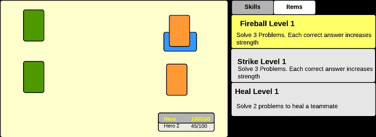
Here are some mock ups for the combat system:
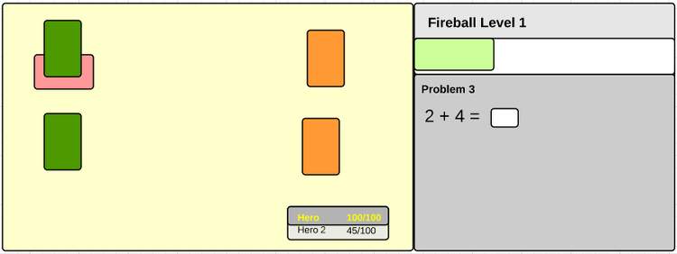
And here is a screen shot of the current implementation:
My mock ups tend to serve as a rough outline of what could work. The focus is mainly layout and various UX considerations. I prefer the lo-fi approach, because basic shapes and colors make it easier to focus on the bigger picture. As an example, once I implement my design, I tend to get caught up with perfecting my CSS and HTML markup and I worry about the color of buttons, the font size, etc. Since I’m not a designer and have no training, you can see how this can become a very slow process.
The combat system is still rough. For instance there’s no way for a player to see how well they did on the math problems for the battle. Maybe after the battle ends, there should be a brief summary of how they did? I’m not sure yet. There are a lot of details.
I also worked with React some more, and I’m liking it more and more. There’s a definitely a learning curve, but it’s not too bad compared to say Angular. Backbone views can be a huge pain to code once an application reaches a certain amount of complexity. This has to do with nested views and I’ve spent many, many hours trying to develop a solution. Granted this is mostly because I tend to use vanilla Backbone with no extensions. I know there are some extensions that tackle this issue.
Here is a demo with the current combat system. You can view the demo here.