Sections 2.2 and 2.3 of Machine Learning in Action go over two more examples. These examples are bit more realistic, but as a reader I still get the feeling that they are bit contrived. In my brief experience with machine learning, the challenge is data wrangling. Often times the data is a mess. There are missing values, not enough data points, data that would be useful but was not collected. With that said, these two examples do provide examples of potential data wrangling challenges, in particular: normalization and image data.
The first example involves a dating dataset that includes three features:
- Number of frequent flyer miles earned per year
- Percentage of time spent playing video games
- Liters of ice cream consumed per week
There are also three classifications:
- “Didn’t Like”
- “Like in small doses”
- “Like in large doses”
The features used here help illustrate the wide range of values that data can come in. This is different from the first example that used x and y coordinates. In this case frequent flyer miles can be in the thousands, whereas percentage of of time playing video games is between 0 and 100. And finally, most people aren’t going to consume more than a few liters of ice cream a week. Without normalization, the frequent flyer miles will have more weight since those values are largest. We want the values to be equal in weight, hence the normalization.
The normalization calculation is straightforward. We want all values to be between 0 and 1, so we can use the following equation:
norm_value = (value - min_value) / (max_value - min_value)
The second example involves handwritten digit recognition. Each digit is a 32x32 black and white image. For simplicity Harrington has extracted all the image data and converted them to text files.
Each pixel in the image is considered one feature, giving us 1,024 features to calculate. From there we can simply plug the data into the kNN algorithm to classify the digits. It ends up working very well with an error rate of 0.011628 or 1.2%.
Error rate is calculated as total errors divided by the number of examples. In this case 11 errors were made out of 1,000 examples.
For the dating data set example, scatter plots are plotted with matplotlib. This is to help visualize possible clusters in the data to provide intuition on what may occur before running kNN. I ended up using the python port of ggplot to graph the scatter plots since I find that interface a bit simpler and it looks better. Here are the graphs.
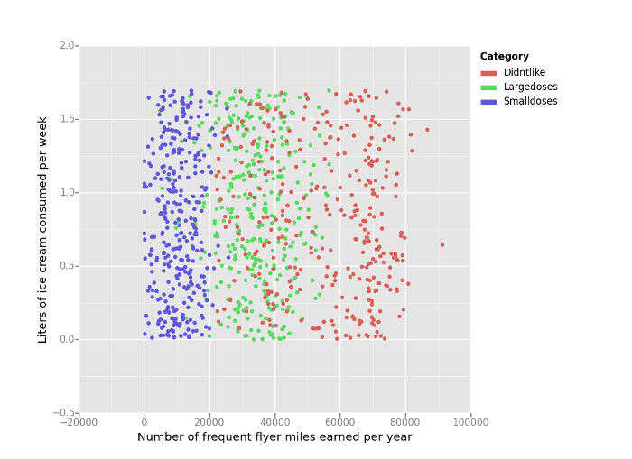
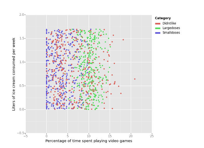
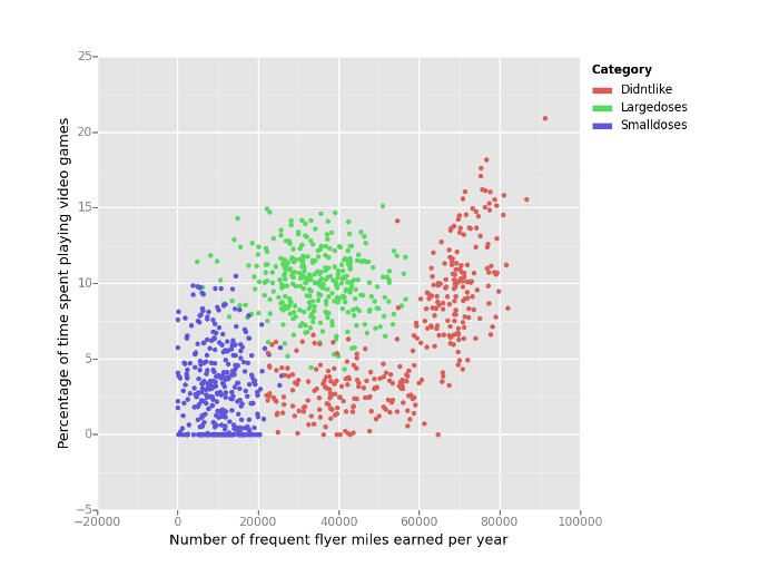
The third scatter plot of video games to frequent flyer miles shows three clear clusters, while the other two graphs are more mixed.
For examples 2.2 and 2.3, I rewrote the kNN algorithm using Pandas. The book uses pure numpy.
Here is the implementation with comments removed:
def classify(input_data, training_set, labels, k=1):
    distance_diff = training_set - input_data
    distance_squared = distance_diff**2
    distance = distance_squared.sum(axis=1)**0.5
    distance_df = pd.concat([distance, labels], axis=1)
    distance_df.sort(columns=[0], inplace=True)
    top_knn = distance_df[:k]
    return top_knn[1].value_counts().index.values[0]
For each example subtract the corresponding feature from the input data.
distance_diff = training_set - input_data
Next square the difference of each feature.
distance_squared = distance_diff**2
Then take the square root of the squared distance of each feature.
distance = distance_squared.sum(axis=1)**0.5
Now combine the classification with distance calculation of each example.
distance_df = pd.concat([distance, labels], axis=1)
With the classifications linked to the distance, we can sort the array from closest to farthest.
distance_df.sort(columns=[0], inplace=True)
Extract the top k closest examples.
top_knn = distance_df[:k]
Return the classification of the most common neighbors
return top_knn[1].value_counts().index.values[0]
Here is the full kNN implementation using Pandas. The dating data set is used here:
import itertools
from ggplot import ggplot, aes, geom_point
import numpy as np
import pandas as pd

dating_test_set = '../sample/Ch02/datingTestSet.txt'

column_names = [
    'Number of frequent flyer miles earned per year',
    'Percentage of time spent playing video games',
    'Liters of ice cream consumed per week',
    'Category'
]


def load_file(filepath):
    """
    Loads data in tab-separated format

    Args:
        filepath: Location of data file

    Returns:
        Data and labels extracted from text file
    """
    data = []
    labels = []
    with open(filepath) as infile:
        for line in infile:
            row = line.strip().split('\t')
            data.append(row[:-1])
            labels.append(row[-1])
    return data, labels


def normalize(df):
    """
    Normalizes data to give equal weight to each features.

    General formula:

        norm_value = (value - min_value) / (max_value - min_value)

    Args:
        df: Pandas data frame with unnormalized data

    Returns:
        Normalized dataframe, range of values, min values
    """
    min_values = df.min()
    max_values = df.max()
    range_values = max_values - min_values
    norm_df = (df - min_values) / range_values
    return norm_df, range_values, min_values


def classify(input_data, training_set, labels, k=1):
    """
    Uses kNN algorithm to classify input data given a set of
    known data.

    Args:
        input_data: Pandas Series of input data
        training_set: Pandas Data frame of training data
        labels: Pandas Series of classifications for training set
        k: Number of neighbors to use

    Returns:
        Predicted classification for given input data
    """
    distance_diff = training_set - input_data
    distance_squared = distance_diff**2
    distance = distance_squared.sum(axis=1)**0.5
    distance_df = pd.concat([distance, labels], axis=1)
    distance_df.sort(columns=[0], inplace=True)
    top_knn = distance_df[:k]
    return top_knn[1].value_counts().index.values[0]


def plot(df, x, y, color):
    """
    Scatter plot with two of the features (x, y) grouped by classification (color)

    Args:
        df: Dataframe of data
        x: Feature to plot on x axis
        y: Feature to plot on y axis
        color: Group by this column
    """
    print(ggplot(df, aes(x=x, y=y, color=color)) + geom_point())


def main():

    # Load data
    raw_data, raw_labels = load_file(dating_test_set)

    # Convert data to Pandas data structures
    labels = pd.Series(raw_labels, name=column_names[3])
    df = pd.DataFrame.from_records(np.array(raw_data, np.float32), columns=column_names[:3])
    df[column_names[3]] = labels

    # Normalize data since ranges of values are different
    norm_df, range_values, min_values = normalize(df)

    # Use first 10% of data for testing
    num_test_rows = int(norm_df.shape[0] * .1)

    # 90% training data
    training_df = norm_df[num_test_rows:]
    training_labels = labels[num_test_rows:]

    # 10% training data
    test_df = norm_df[:num_test_rows]
    test_labels = labels[:num_test_rows]

    # Apply kNN algorithm to all test data
    result_df = test_df.apply(lambda row: classify(row, training_df, training_labels, k=3), axis=1)

    # Calculate the number of correct predictions
    error_df = result_df == test_labels
    print error_df.value_counts()


if __name__ == '__main__':
    main()