This post focuses on the design of the UI for the poker game.
The UI
For this project I experimented with sketching out the UI using Apple Pencil and an iPad.
In the past I used LucidChart for creating higher fidelity mockups, which I found effective for mocking up quick wireframes, but one drawback is that sometimes I would spend too much time tinkering.
The pencil and iPad approach prevents the constant tinkering, but leads to messier designs that can be harder to interpret.
The sketches shown in this post are mildly cleaned up versions of my original notes.
Requirements
- Support desktop, tablet, and mobile devices
- Chat window
- A way to input actions, such as bets
- Video streams for each player
- Community cards
- Player hole cards
- Player name
- Player chips
- Player bets
- Pot size
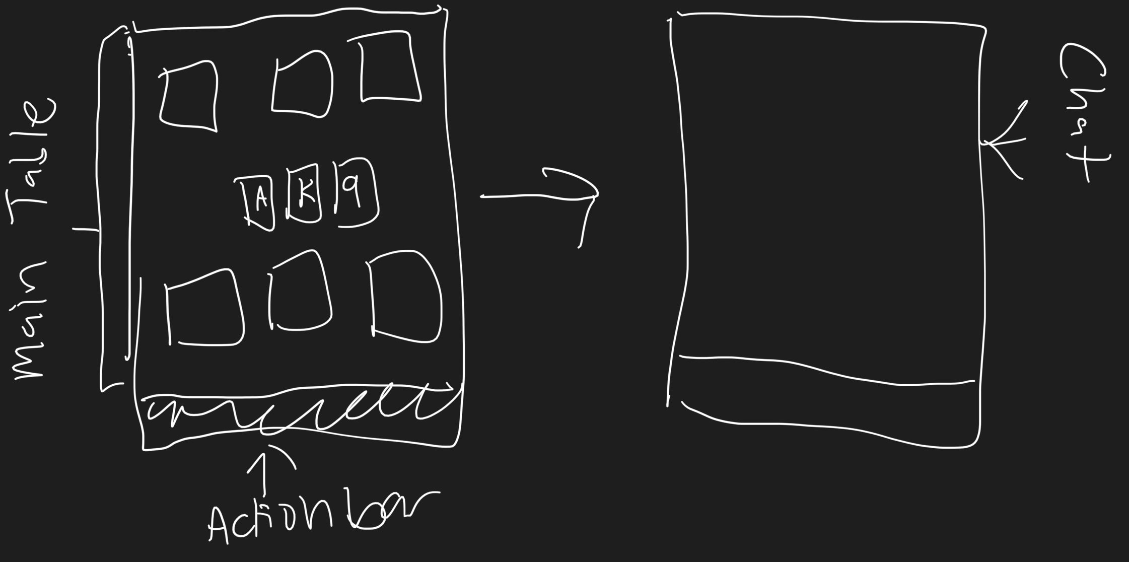
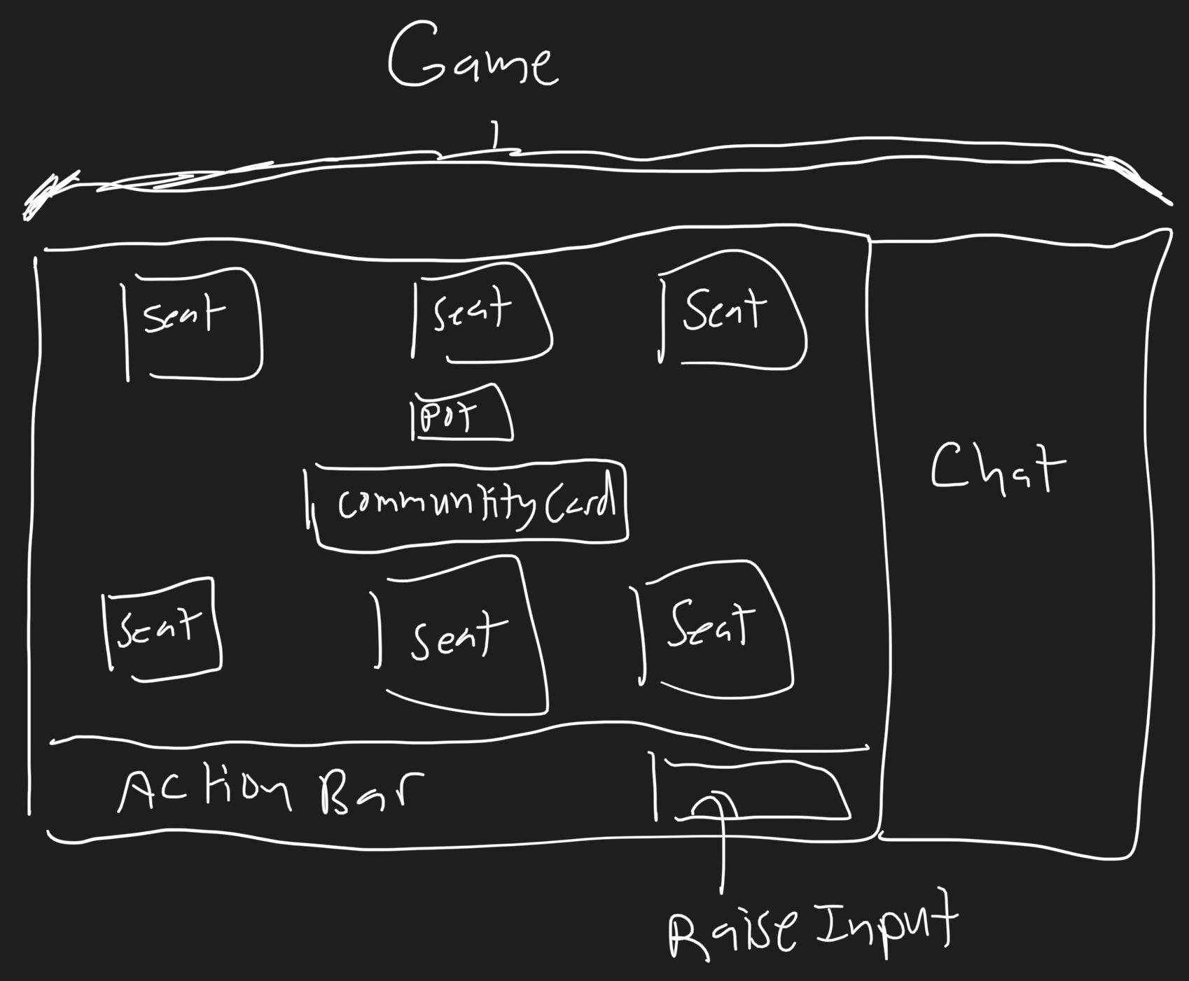
High level mockups
The main consideration for the high level layout was to make sure the design was responsive with minimal changes.
This meant avoiding a skeuomorphic design where players are arranged around a circular poker table. The main issue with this approach is that players would need to be positioned carefully around the table. Everything would need to be repositioned and scaled with the size of the window.
This is also the reason why the game is limited to six players for the time being. I could not figure out a simple way to arrange ten players at a table while also including video. One consideration was to use a column layout. But this would make the layout too unfamiliar.
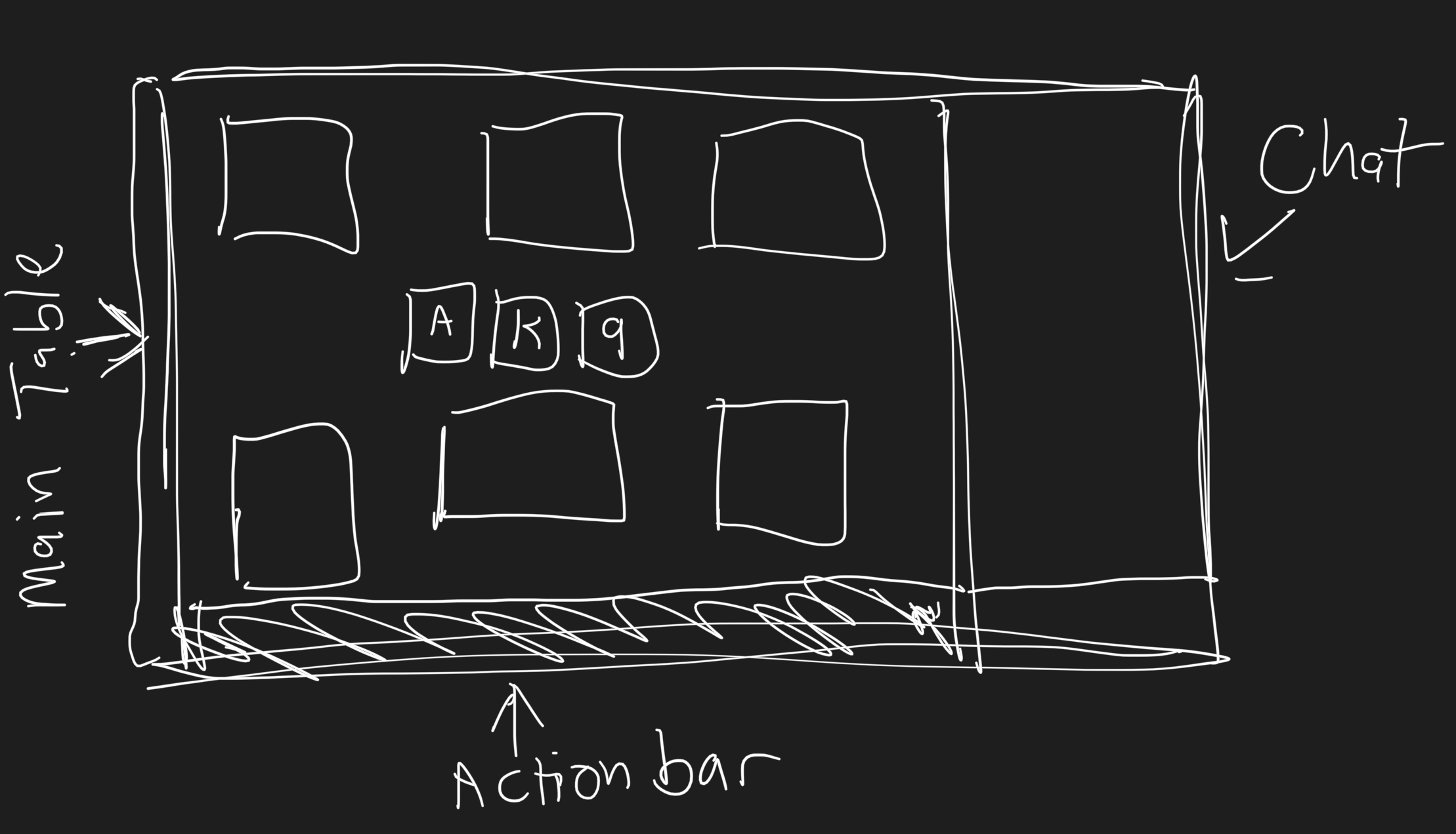
For mobile devices, the chat sidebar is hidden for the time being.
I am thinking that a player should be able to view the chat by swiping right. Then they can switch back by swiping left. This is similar to the behavior in the Slack mobile app.
The problem with this is that it may not be intuitive. A dedicated button for switching to the chat view would likely be needed.
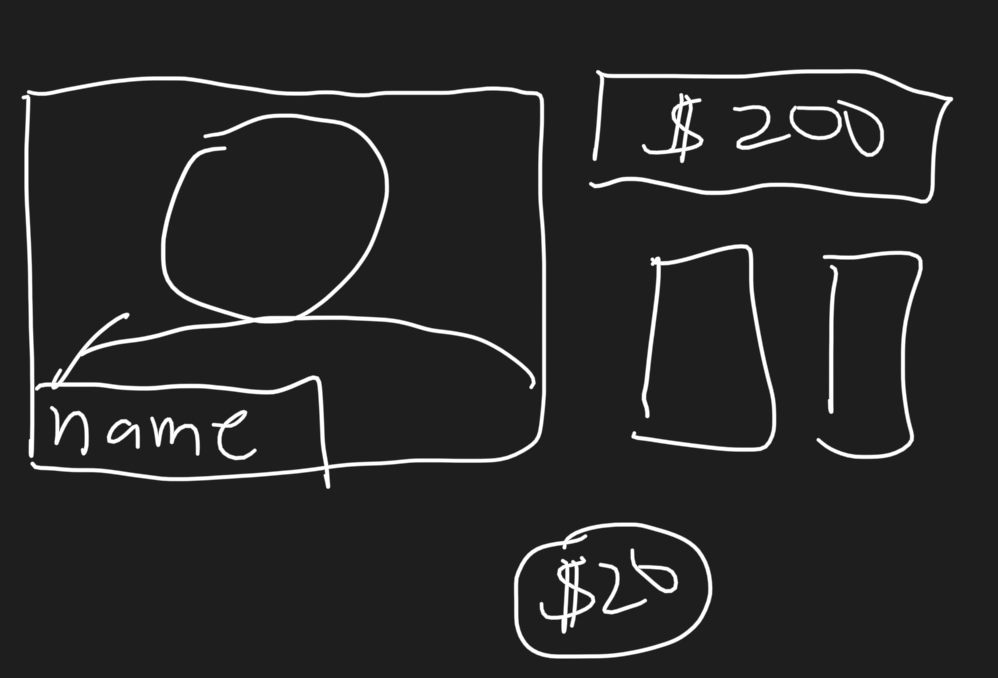
Player seat mockups
Designing the layout of the individual seat/player area was challenging since I needed to balance a number of different requirements.
Ideally the area for the player’s video stream is relatively large, but the player’s cards also need to be readable. In addition, their name and number of chips are also important data points to display.
One of the first variations I attempted used too much vertical space. This made it so that the action bar was displayed below the fold, which meant the player needed to scroll down to perform an action.
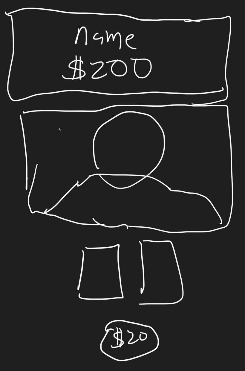
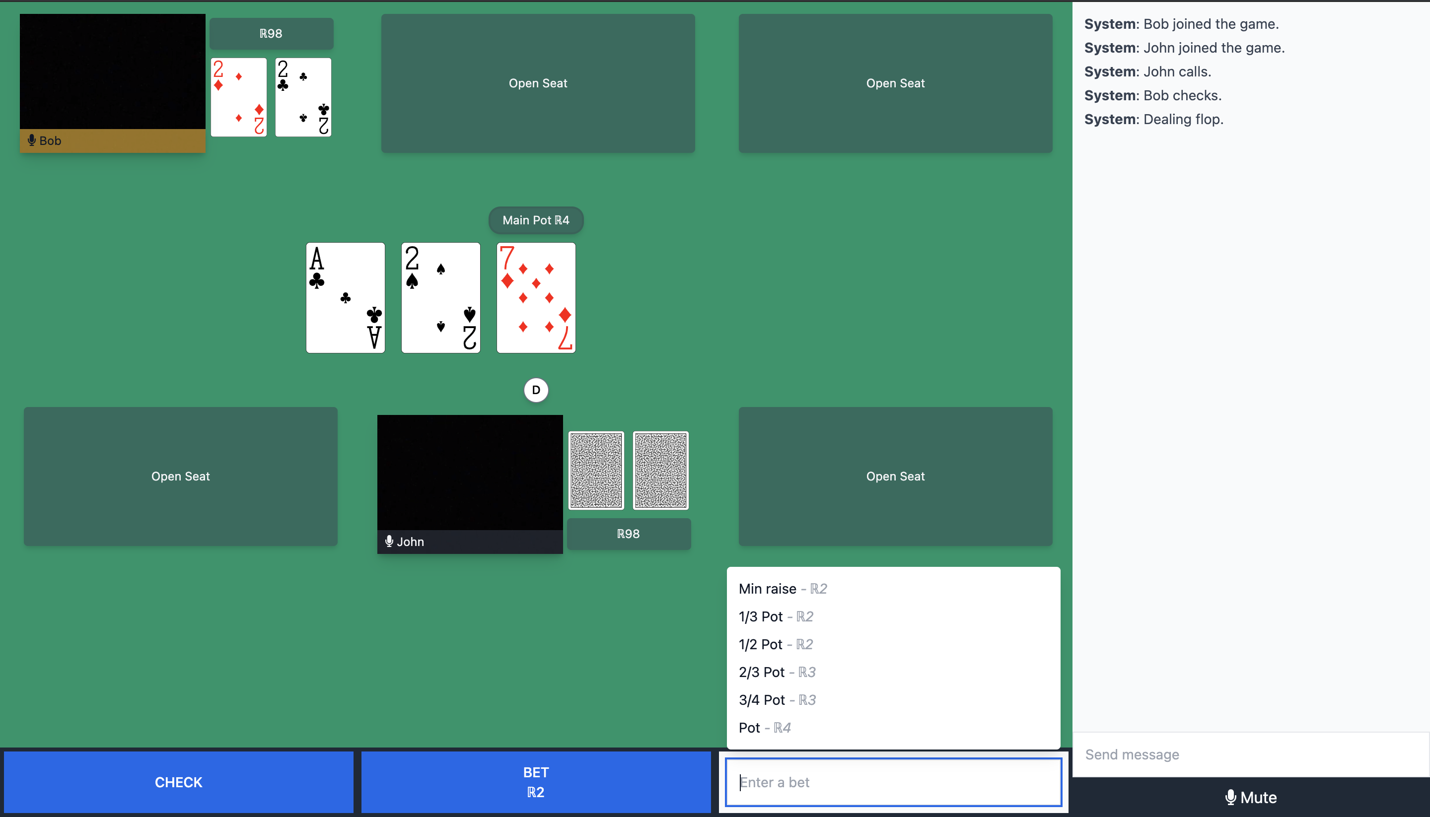
The current version uses a two column approach. This makes the video smaller and overlays the player’s name over the video to save space.
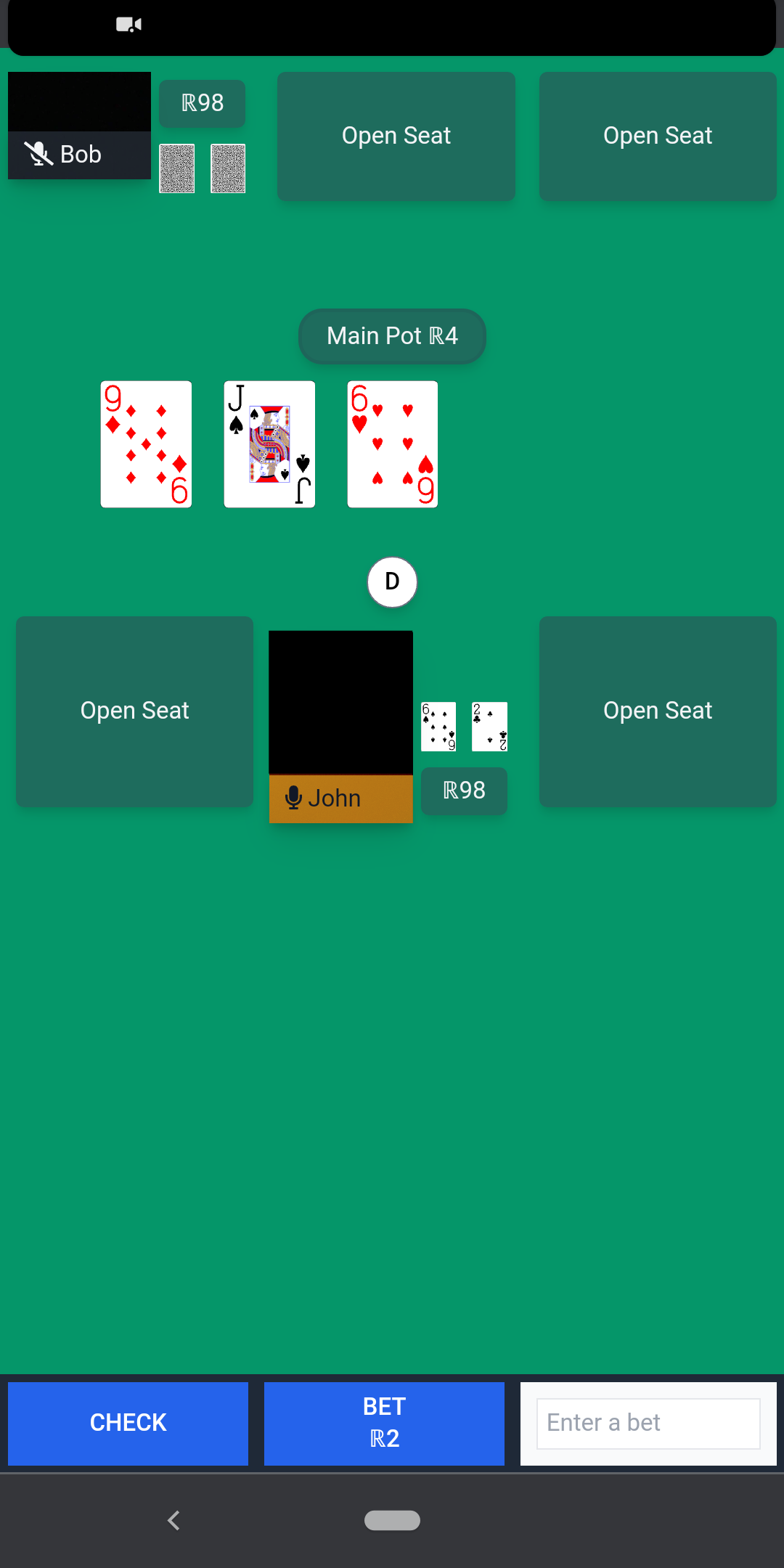
This layout works OK for desktops, but not as well for mobile devices. The video and cards are too small. One option is to remove video altogether. Another is to use layout variation 1 since mobile devices have more vertical space to work with. This is a decision that I am still mulling over.
Action bar mockups
The action bar was the next UI element that required some thinking. I had two goals here.
The first was to make it easy and intuitive to perform actions, especially bets/raises.
The second was to make sure the interface worked for mobile devices.
The first variation used a slider input and a textbox. The player could drag the slider to adjust their bet. This had some noticeable drawbacks. It was difficult to make precise bets, so I tried adding ticks via a datalist element. This partially worked, but the problem was that the ticks would be too close together for certain default bets. The second problem was that the size of the slider was not mobile friendly.

The second variation used a textbox with an auto suggest dropdown for common betting/raising options. This worked well since it allowed for easy selection of raises from both desktop and mobile devices.
One drawback of both these variations is that it may not be intuitive to player’s that the input box is used adjusting bets/raises. This was an observation I made during a play test with some volunteers at work. Though one caveat is that not all players knew how to play poker, so that may have attributed to the lack of non-minimum bets/raises.

React Components
React is nice because the concept of components intuitively translate to different parts of a UI. A chat sidebar, becomes a chat component. The action bar becomes an action bar component. And so on.
The main consideration is how far to break down a component. When does it become too granular? When does it stop becoming an effective abstraction?
My rule of thumb is to start less granular. Start by making the obvious components. This avoids hasty abstractions, such as turning a button into a button component.
A good example of this is the ActionBar. Initially the raise input was part of the same component. But since the usage had very specific behavior and logic, I factored it out into its own component.
List of components:
- ActionBar.js
- Chat.js
- CommunityCards.js
- Pot.js
- RaiseInput.js
- Seat.js
These components are used inside a Game.js component which contains the main layout for all the sub-components.
UI screenshots
Here are some screenshots of desktop and mobile versions of the UI. The player video stream panels are black since I covered them up.
The mobile view needs more work.
- The player’s hole cards are barely readable.
- The video panel is vertical instead of horizontal. Granted that works well for mobile displays.
- The area that displays the player’s chips is too small for values greater than three digits.
- The auto suggest dropdown is cramped, which causes some rows to take up two lines instead of one.
Repository
The Github repository can be found here: